
 Yahoo Finance
 The best tweets about the new Best Buy logo

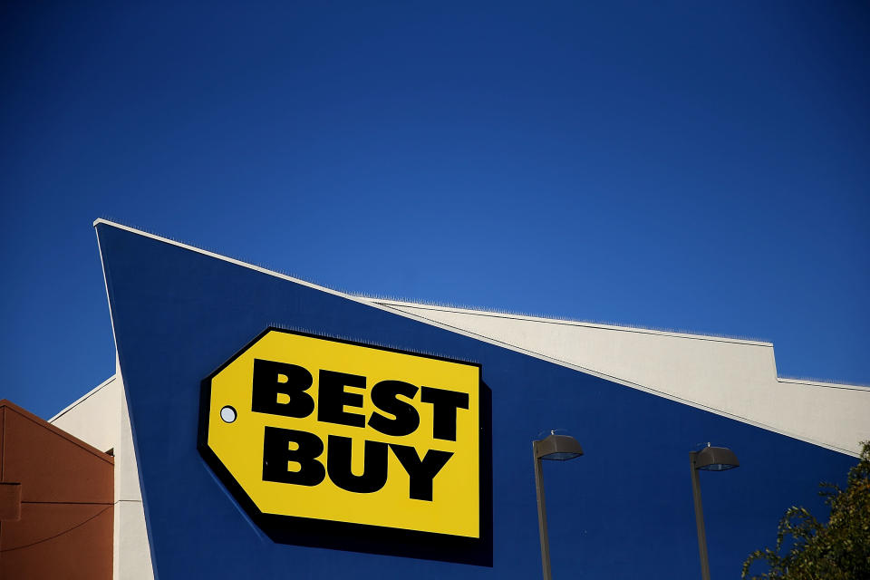
Big box tech retailer Best Buy has changed its logo, ditching the familiar large, yellow tag design for a more streamlined look. The tag has been reduced to a small graphic at the bottom right of the text.
.@BestBuy launches refreshed branding, logo.
Learn more: https://t.co/eznI5j5KvO pic.twitter.com/Ygv7qeeZu3
— Best Buy News (@BBYNews) May 9, 2018
According to a press release from the company, “the creative elements of the refreshed branding include an updated Best Buy logo and a new look and feel with updated colors, photography and conversational language. It’s all designed to highlight our culture, our expertise and our talented employees.”
We’re not completely sure how the blocky text and small graphic highlights culture and expertise, but OK, sure…who are we to argue?
Twitter did not hold back its feelings when it comes to the new logo.
A common theme of the criticism is the fact that the new logo is reminiscent of things we’ve seen before, notably Bud Light:
The new @BestBuy logo sort of looks like a cross between the logos for Finding Dory and Bud Light. pic.twitter.com/vDs3cyC1dC
— Aaron Bearden (@mclaaron) May 9, 2018
“Yo chief you mind if I copy your homework?”
“Yeah fo sho, just change it up a bit ya know?”
“alright, bet.” pic.twitter.com/aBeTkg4Aop
— Avalanche (@AvalancheTwitch) May 10, 2018
Best Buy’s new logo has me feeling weirdly thirsty for some reason https://t.co/kwZqIAcqoS pic.twitter.com/QaExdirJFK
— Chaim Gartenberg (@cgartenberg) May 9, 2018
.@BestBuy kills its iconic logo . . . and embraces light beer? https://t.co/m5h7c8vsJo pic.twitter.com/EUqqKUPbFB
— Co.Design (@FastCoDesign) May 10, 2018
Others just straight up didn’t like the new look:
this logo is remarkably bad https://t.co/JVNzzOrSxv
— Jake Kastrenakes (@jake_k) May 9, 2018
Best Buy. Worst Logo.
Not a big fan of this new design. pic.twitter.com/LpGsxfuxFP
— Howard Pinsky (@Pinsky) May 10, 2018
And of course, what would Twitter be without just a touch of sarcasm?
Excited to announce that @BestBuy chose me to create their new logo pic.twitter.com/2ZRg5Atcox
— gift horse (@wrappedstallion) May 10, 2018
At least one person had something remotely positive to say:
someone needs to learn about kerning but that old best buy logo HAD to go pic.twitter.com/0S8EQd45ui
— tc is online (@chillmage) May 9, 2018
What do you think of the new Best Buy logo? Is it an improvement or are you pining for the yellow tag days of yore?
Download the Yahoo Finance app, available for Apple and Android.
