
 Yahoo Finance
 Two Markets That Show Incredibly Strong Technicals With Long-Term Trends
I’ll get straight to the point and say that the two markets I’m talking about are equities and precious metals. If you’ve spent a bit of time reading finance related articles as of late, this should not be a big surprise. Both have been gaining traction in the media.
My view differs in that I see a significant upside in both, supported entirely by technical charts. Fundamentals factors are supporting a rise in both assets, but this article will focus strictly on the technical outlook. What makes me think that the upside will be significant is that charts that are correlated to these markets are all sending a similar signal.
A Look at the Global Markets
Let’s look at equities for example.

If you look at a weekly chart of the S&P 500 it’s quite clear that a notable correction took place in 2018 and then another in 2019. I think the latter is probably still fresh in the minds of many, but more on that later.
Looking at some of the global markets, a similar yet distinctly different pattern is seen.
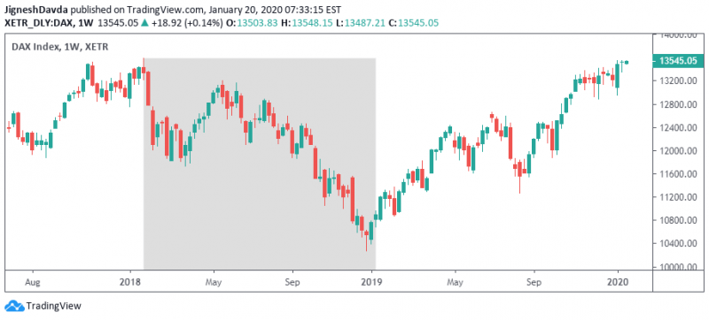
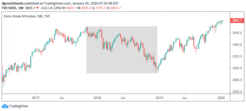
The German DAX also had a correction in early 2018, however, the bearish trend lasted until the end of the year. The same can be said about the Euro Stoxx 50 index.
Looking at the S&P 500, it was not all that transparent that the global markets were in fact trading within a bearish global cycle in 2018. The US index managed to stage a rally that year which reached record highs after all.
Bottom Line
The takeaway here is that the rally that began at the start of last year marked the beginning of a globally correlated bull market. That is much more powerful when compared to the rally in the S&P 500 after the correction in 2018. To be clear, not every index around the world shows a bullish pattern. But the popular ones do and it signals some real strength.
This is why, for some time now, I’ve felt like it doesn’t make sense trying to wait for a dip. Not to say that I’m completely ruling out any downside, it’s always important to consider the potential. But it certainly is difficult to make a bearish case when looking at the larger time frames and the broader markets. But I do understand that the sharp correction in late 2018 is still fresh in the minds of many and has had some on a constant lookout for a correction.
The Outlook for Gold Prices
The outlook for gold prices is similar. The precious metal traded in a bearish trend from 2011 until the end of 2015. A bullish trend emerged in 2016, however, it fizzled somewhat later in the year and a consolidation emerged. Over the summer of 2019, gold prices managed to make a bullish break from the consolidation to once again confirm a bullish trend.

The important thing to keep in mind is that both equities and precious metals are in bullish trends that date back several decades. For gold, the long-term bullish trend might be forgotten. After all, confirmation of a bullish trend only came last summer, eight years after the bearish trend started.
Two things make gold prices dramatically different from equities. First, the upward momentum is not the same, and second, gold has not reached an all-time high.
This is where looking at correlated instruments is useful. Gold prices have broken to fresh all-time highs against the Euro, British pound, Japanese yen, Australian dollar, New Zealand dollar, and Canadian dollar. That’s six of the eight major currencies so there’s certainly a case to be made that the correction from 2011 has completed.
In regards to momentum, gold is not posting gains day after day and week after week the way the S&P 500 is. But I think it’s important to note that dips have been very shallow.
Dips in Gold Have Been Shallow
Gold broke higher over the summer, following the June Fed meeting, after crossing above horizontal resistance at $1366. At that time, several analysts considered getting long at $1350 or even at the $1366 breakout point, but the yellow metal did not retest the breakout point. I think this speaks volumes in terms of underlying strength.
Similarly, gold prices didn’t test the 200-day moving average in December before turning higher. In fact, the indicator wasn’t even tested in the consolidation ahead of the breakout in 2019.
But perhaps the strongest signal for gold is that it is rallying alongside equities. Traditionally, these two carry an inverse relationship. Not only that, gold has rallied even during periods of dollar strength. When assets stray from correlation, and don’t return, it tends to send a powerful message.
Bottom Line
I think the odds of a dip in gold are higher than in equities, but I’d feel comfortable buying both at current levels and holding them for the long-term.
This article was originally posted on FX Empire
