Yahoo Finance
 The Pantone Color of the Year 2022 Is Here—and It's Totally Unexpected

Pantone
When choosing the Pantone Color of the Year 2022, the Pantone Color Institute did something it has never done in the past 22 years since it unveiled its very first Color of the Year in 2000: It created a brand-new color rather than select from the company's already vast array of hues. To truly reflect the transformative times we are currently living in, even the process behind choosing the Color of the Year had to break with tradition. After much deliberation, the company landed on a new color that symbolizes these unprecedented times of change. Introducing, the Pantone Color of the Year 2022: Very Peri, a vibrant shade of periwinkle blue with energizing violet-red undertones.
Ahead of the announcement, we chatted with Lee Eiseman and Laurie Pressman, the executive director and vice president of the Pantone Color Institute, respectively, about the meaning and process behind the Color of the Year 2022. Here's what they revealed about the trendsetting hue, plus some easy ways to work the color into your own home.
RELATED: Pantone Just Revealed 2 Colors of the Year for 2021—Grab a Paintbrush!
The meaning behind the Pantone Color of the Year 2022
Since its founding, the Pantone Color of the Year has sought to encapsulate the cultural moment, to reflect the global zeitgeist. Very Peri attempts to do just that for the year ahead. "It embodies a courageous presence and encourages personal inventiveness and creativity," says Eiseman. "And if there was ever a time historically where we need that—we need that encouragement, we need that uplift." This complex hue is considered a member of the blue family, which is generally seen as familiar, steadfast, and comfortable, but by infusing it with an undertone of violet-red, it gains energy and dynamism, Eiseman explains. This combination of cool and warm tones feels new and unexpected, a reflection of the type of innovation this moment in history calls for. "It helps us to embrace the future, the possibilities, as we rewrite our lives," says Eiseman.
"It's still what you would call an untypical time, compared to how we lived before," says Pressman. "Whether we're looking at the continuation of all these environmental protests, the cultural clashes about social inequality in different parts of the world, and of course, there's the global pandemic. So all of these things coming together are influencing our social values, our cultural values, our personal values. And every one of us in different ways, whether personally or professionally, is looking to rewrite our lives and reimagine what our lives are, because they've been so different." Very Peri symbolizes the need for creative solutions and fortitude to address the unprecedented challenges we face.
RELATED: The Benjamin Moore Color of the Year 2022 Is Here—and It's One of Our All-Time Favorites
How the Pantone Color of the Year 2022 was chosen
Typically, the Color of the Year is chosen from Pantone's more than 2,000 existing colors. But for 2022, the company decided it was necessary to formulate a new color, Pantone 17-3938 Very Peri, which will now be added to the company's selection of solid color chips. "You look around, and if you have to think of one word, it was 'transformation.' How, if you're looking at transformation and what's taking place in the global zeitgeist, how do you mark the transition that we're going through if we don't illustrate that through the color?" asks Pressman. Changing the process behind choosing the Color of the Year was another way to reflect the innovation of this moment in time.
"Unlike in previous times when we've added colors to the palette and we're adding it based on where we see color going, this was done messaging first, name first almost, with a very clear vision of what this color needed to look like," explains Pressman. The team knew they wanted a futuristic color that reflected the global innovation taking place at this moment and had ties to the digital world—the technical aspects of developing the color and replicating it across mediums (printed paper, dyed fabric, digital assets, etc.) followed from there.
How to work Very Peri into your home decor:
Eiseman's advice for decorating with Very Peri: "Be experimental with it, have fun with it, enjoy it, and it will bring you more joy." Whether you're already reaching for the paintbrush or want to start small, here are three easy ways to bring the color home.
Paint an accent wall
Eiseman reports that she recently painted her own bedroom in a shade of periwinkle, inspired by Very Peri. "We have the inherent feelings of the mother color blue, but you've added that element of excitement and dynamism as an undertone—it's really a great color to use on the walls," she says. Follow her lead and brush the hue on a wall in your bedroom, bathroom, or dining room.
To prevent the hue from feeling overwhelming, consider painting just one accent wall or opt for a softer shade of the hue. If you prefer a close match, you can have a custom paint color mixed up based on the Pantone chip, or try Bellflower by Dunn-Edwards.

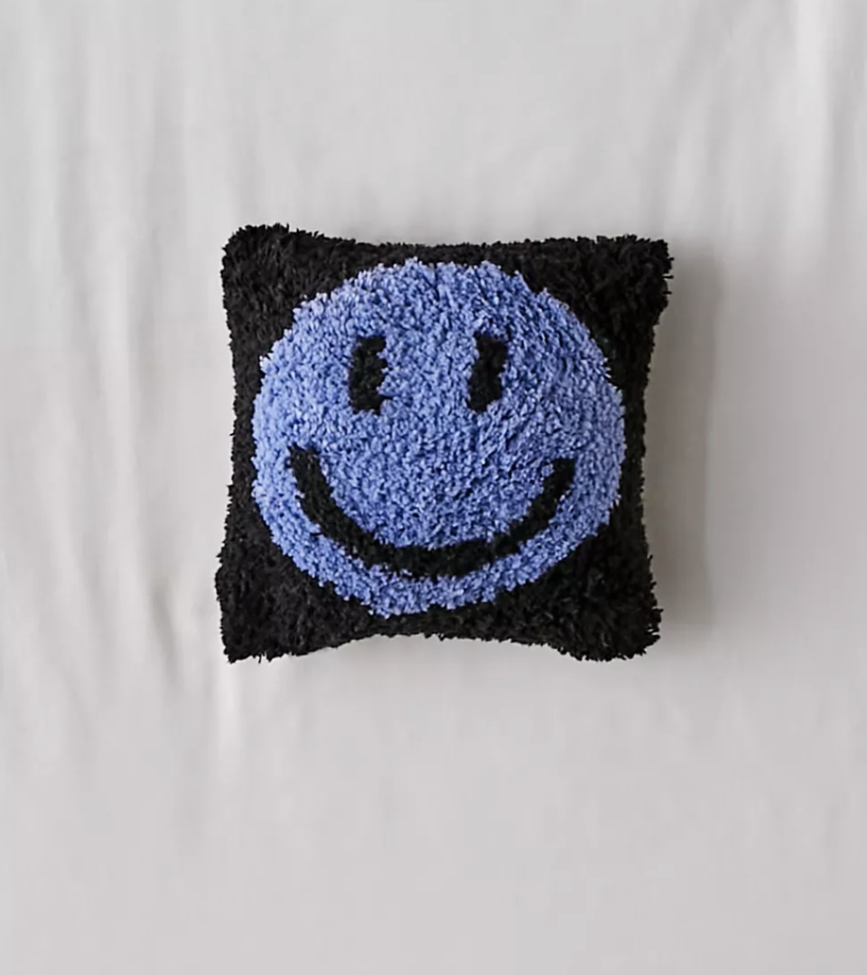
Shop for accessories
Not ready to bust out the paintbrushes? Shop for inexpensive pieces of decor that include the hue, such as throw pillows and small area rugs. They'll also be easy to switch out whenever you're ready for a fresh look.
Pick a pattern
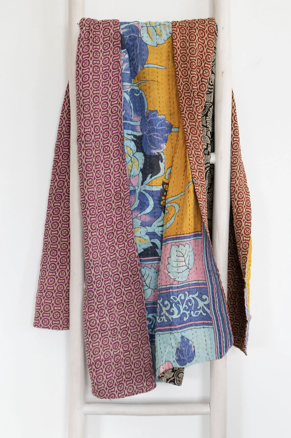
If you'd like to introduce Very Peri into your home but want to take a subtler approach to the hue, keep an eye out for patterns that incorporate the color, such as the botanical design featured on this kantha quilt.