
 Yahoo Finance
 17 Logos We Love
Branding 2014
Identity is a brand's most defining expression. At its heart it represents not only a commitment to a collective cause but also the essence of a brand's behavior and heart: who you are, what you stand for, what motivates you. The best logos give each company a unique place in the world, connecting the truths at the heart of the brand with consumer desire. In this way, identities serve as an essential point of connection between commerce and culture.
Small companies with nimble business practices are reshaping the global economy, and this fluidity is increasingly present in other areas as well. There's a new cultural macro shift--infiltrating everything from fashion to food--that celebrates individuality and freedom of expression with a sharper focus on craft, culture and personality, compelling building blocks when it comes to designing the brands of the future.
The logos on the following pages celebrate their brands through creative, craft-driven design, illustrating that at the root of each business lies soul and a commitment to connection with consumers.
Gotham Books
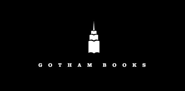
The imprint's nostalgic name combined with the image of iconic architecture--a simple, clever skyscraper made of books--is a powerful metaphor for the staying power of traditional publishing.
Eric Baker Design
Optus

The new logo for Australia's Optus speaks to the personal nature of the telecoms business, using a fun and accessible typeface to frame the brand and its commitment to customer service. A secondary brand language, "yes," reiterates that positivity and emotional connection and assures customers that they are in attentive hands.
Re
Speak Up Africa

Nonprofits often lack the funding to invest in design, but this logo for Speak Up Africa, a communications and advocacy organization for children's health, has received enormous support as a result of its clear and powerful logo. The identity--sound waves in the shape of the African continent--translates directly to the brand's mission.
DIA
Ginger & Jagger

A furniture brand inspired by the natural world and the beauty in organic materials, Ginger & Jagger has an identity that speaks to the journey from raw to refined, employing interlocking geometric shapes pulled from patterns found in nature. As the brand translates across other touchpoints these subtle shapes shift, mirroring the inconsistency found in natural materials.
This is Pacifica
Augusta Ventures

Logos for financial institutions are often dry, safe and indistinct. Augusta Ventures, a litigation-funding business, shirks that stereotype with a logo that is functional, professional and bold, helping it to stand out from the crowd without alienating its consumer base. The two A's with the V in the middle form a smart, well-balanced monogram that symbolizes partnership and victory.
Moving Brands
Sunfeel
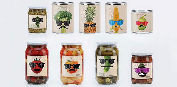
Canned food no longer has to be boring, thanks to this clever identity for Russia's Sunfeel, which specializes in produce grown in natural sunlight. The logo is instantly recognizable and comes to life through the lens of the food items upon which it is placed. In branding, this type of company is referred to as a "challenger"--one attempting to shake things up--and this cheeky logo certainly helps Sunfeel stand out in its category.
:OTVETDESIGN
Parc Olympique

This new identity for the 40th anniversary of Montreal's Olympic Park draws inspiration from the O of Olympics, the iconic rings and the circular shape of the Olympic Stadium. The four colors and circles represent the park's four main structures. The logo is layered enough to support a robust communications and identity system that helps to revitalize an icon of Montreal.
lg2boutique
The Guild of Food Writers
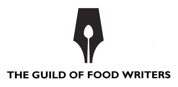
With its excellent use of negative space, this simple logo connects the experiences of writing and eating into a charming seamless identity.
300million
Bzzz Armenian Honey

This honey brand artfully uses a beehive as a stand-in for the letter B, while flowing z's hint at the product's smoothness and fluidity. The mark is produced in metallic gold--emphasizing the product's premium status--on honeycomb-shape boxes or burned into beautiful wooden packaging in the shape of a beehive.
Backbone Creative Studio
Slice

This identity was developed for a company that creates innovative cutting implements. The bold, clean design speaks literally to the brand's mission and guarantees that the company's identity is as sharp as the tools it makes.
Manual
Bricos
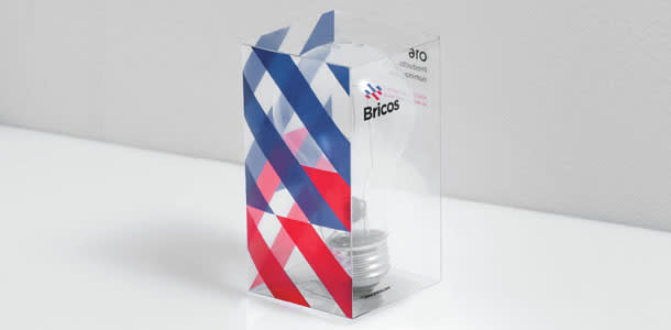
This rebrand for Bricos has elevated the Mexican electrical hardware store far beyond its competitors. The typeface is clean and trustworthy, and the red and blue pattern evokes heating, energy, plumbing and electrical systems. The pattern's movement is also reminiscent of travel, highlighting the company's wish to expand and gain international clients.
Anagrama
Know Canada
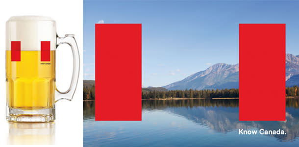
Rather than incorporating the age-old maple-leaf icon, this new identity uses the red bars of the Canadian flag as a frame for an ever-changing range of imagery, allowing the country to literally frame itself in a more positive, diverse light. The changeable logo projects versatility, energy and innovation.
Bruce Mau Design
Shatto Milk Company

This understated logo has served this dairy farm near Kansas City well for more than 10 years, helping to create cult status for its quick-selling premium products. The clean identity with its earnest cow portrait stands out against the glass bottles, which emphasize farm freshness and sustainability. It's a great example of the staying power of well-thought-out simplicity.
Sullivan Higdon & Sink
William Gray

This brand mark for a shirt company is a smart balance between classic and contemporary. It succinctly combines the family name and evokes the craft at the heart of the brand's tailored products by balancing a W and a needle with a modern sans typeface.
Slaughter Group
White Knight Laundry Services

The identity for this U.K. company is clearly inspired by its trade but also references its Royal Warrant, issued to tradespeople who supply goods and services to the royal family. The origami fabric folds that create the helmet speak to a level of professionalism and quality. By combining this with a royal purple background, White Knight visually establishes its brand as the benchmark in professional laundry and brings challenger thinking to a previously mundane industry.
Coley Porter Bell
Seao
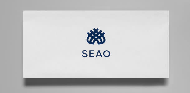
It's surprising that this beautiful logo is for a commercial business that produces, washes and rents textiles. The simple mark gracefully expresses the cotton bud and its transformation into woven products.
Anagrama
My Cuisine Canary Wharf
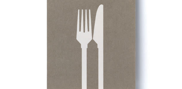
This simple, brilliant identity for a London restaurant brings together a fork and knife and deftly reveals the distinctive Canary Wharf building in negative space.
Radford Wallis
More From Entrepreneur
